
Infographics Make Your Sustainability Story Stick
Your sustainability work is complex. Your communications shouldn’t be. How do you explain net-zero commitments, product lifecycle improvements, or community impact in ways that actually resonate, whether on social media, in a report, on your website, or in a sales presentation? Infographics cut through the noise by making complex information accessible, engaging, and memorable across every format and audience.
Why this matters: People remember 65% of visually presented information after three days, but only 10% when it’s just text (Brain Rules). Infographics establish a common language for your sustainability strategy—aligning communications across teams and connecting diverse audiences from customers to employees to investors.
We’ve seen this work across dozens of client projects. Here’s how three organizations we work with use infographics to drive impact:
HIGHLIGHTS
- Infographics make complex information more memorable than text alone.
- One well-designed infographic can work across channels and audiences.
- Effective infographics require strategic thinking and visual design working together.
Engage customers in their impact
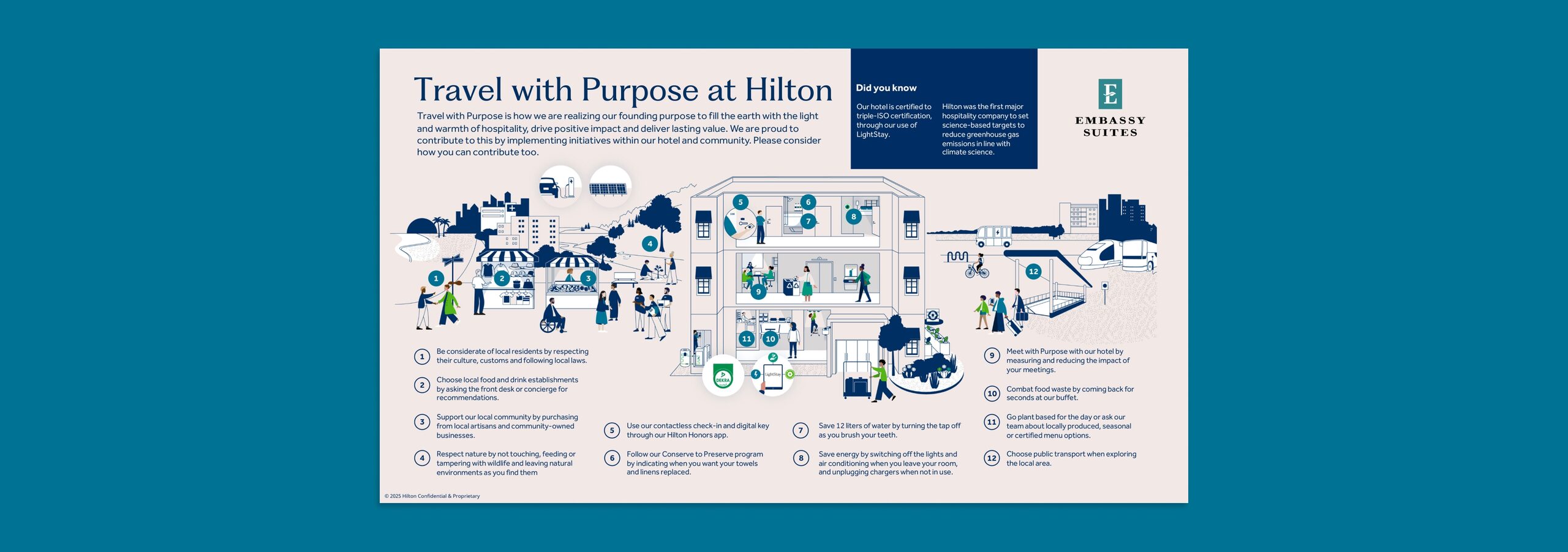
Hilton worked with IOP to create this infographic for their sustainability report, explaining how sustainability fits into the traveler’s journey. We then adapted it for a completely different use: helping individual properties communicate in destinations facing over-tourism pressures. Displayed on in-room TVs, each hotel customizes the graphic to highlight their specific initiatives—from water conservation to supporting local businesses. Hilton invites guests to become active participants in reducing tourism’s impact.
Turn sustainability into a sales team asset
Stanley Black & Decker’s enterprise sales team needed to answer customer sustainability questions. IOP created a highlights document built around a product lifecycle infographic showing how sustainability creates value at every stage—from supplier partnerships to end-of-life recycling. Sales reps can confidently demonstrate how SBD’s sustainability work adds value to their retail and construction customers.

Translate complexity for investors
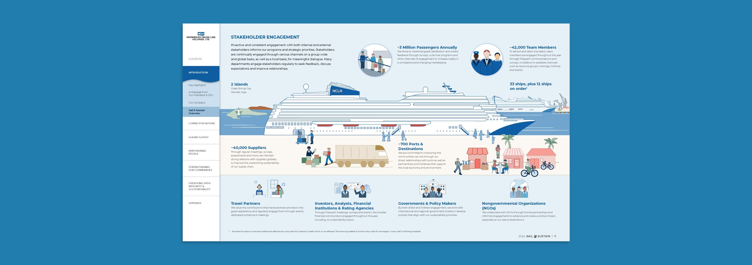
Norwegian Cruise Lines worked with IOP to create this stakeholder engagement infographic for their sustainability report. Instead of text describing relationships with passengers, suppliers, ports, and communities, one visual tells the complete story. Investors can quickly grasp the scope and sophistication of Norwegian’s strategy—and the same infographic could support sales conversations, partnership discussions, or employee communications.
When Infographics Aren’t the Answer
Not every communication challenge needs an infographic. Sometimes a powerful statistic makes more impact than wrapping it in visual elements. If you can explain a concept clearly in two or three sentences, visual complexity might obscure your message. Infographics require clarity of thought, and some sustainability challenges require nuance and acknowledging trade-offs that don’t fit neatly into an infographic. Use them where they add the most value.
How IOP Creates Infographics That Work
Creating effective infographics isn’t about making data look pretty—it’s about translating strategy into visuals. Our collaborative process turns complex sustainability concepts into clear, compelling visuals that work across multiple formats and audiences.
The IOP approach starts with the substance. You can’t create a meaningful infographic without solid information and clear purpose. We work closely with your team to understand what needs communicating and why. We break down complex concepts into their essential parts, wireframing approaches until we land on the right structure. Only then do we layer in the visual storytelling—flow, illustrations, data callouts, and emphasis that guide viewers through your message.
This process is genuinely collaborative. Our strategy, content, and design teams work with your subject matter experts through multiple refinements. The result? Infographics that live in your sustainability report, support your sales team, educate employees, and inform investors—all while maintaining your brand voice and meeting each audience where they are.
We’ve created hundreds of infographics across industries: value chain diagrams, process flows, timelines, maps, and more. Each one built to do real communication work, not just look good.
AI As A Thinking Partner, Not Designer
We’ve found AI tools useful to explore possibilities early in the process. Asking “how might we visualize this supply chain?” surfaces interesting structural approaches. But infographic execution requires human judgment about your brand, your audience, and what actually communicates. AI-generated visuals default to generic templates that undermine the authentic, strategic storytelling that makes infographics genuinely effective. AI is evolving but today, trust experienced humans to execute.
The Takeaway
Infographics aren’t just design assets—they’re strategic communication tools that make complex sustainability information accessible and memorable. When done right, they create a common language across your organization and reach diverse audiences through multiple channels.
Ideas On Purpose Can Help
For over 25 years, we’ve helped organizations create infographics that drive understanding and action. Our team combines strategic thinking and design expertise to turn complex concepts into clear, compelling visuals that work across formats and audiences. Email us to discuss how infographics could strengthen your sustainability story.
Header image is AI generated.